Project: Amber Laptops
"Empowering ambitious young leaders to work with confidence, clarity, and sustained momentum through thoughtfully designed, high-performance technology."
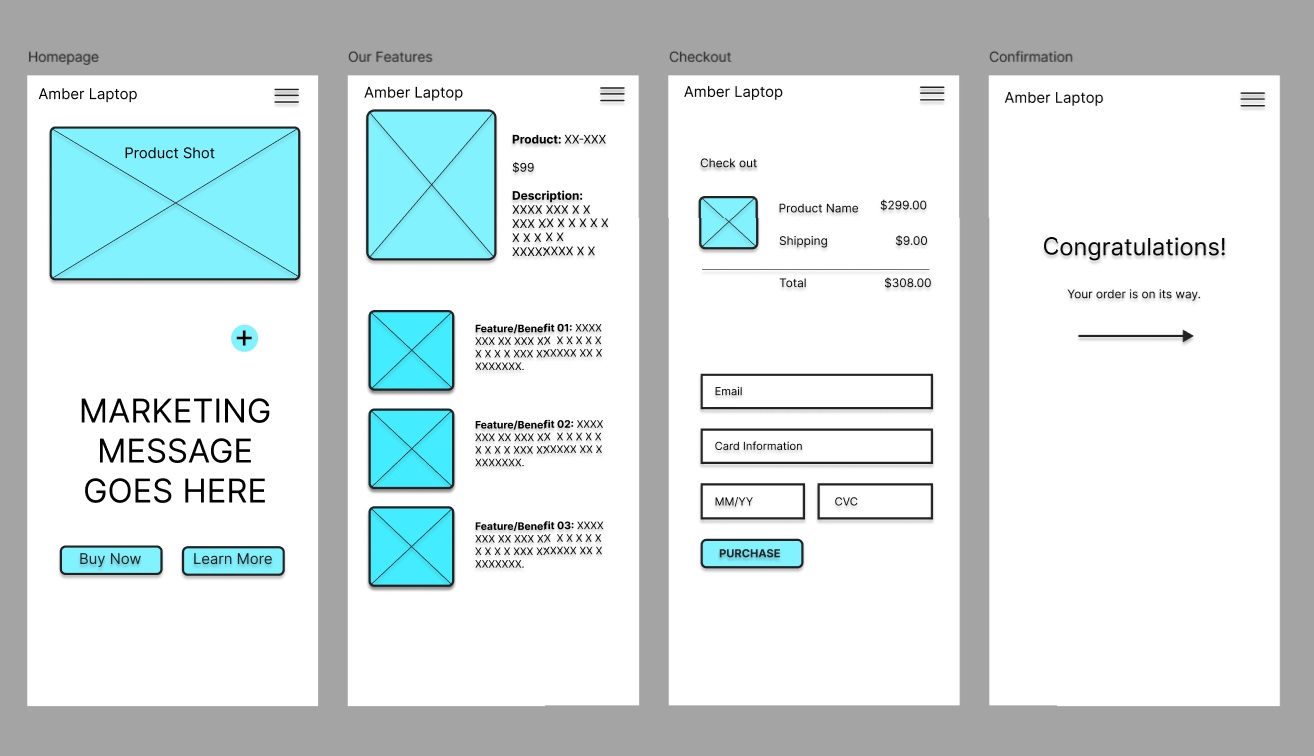
Stage: Wireframes (Mobile)
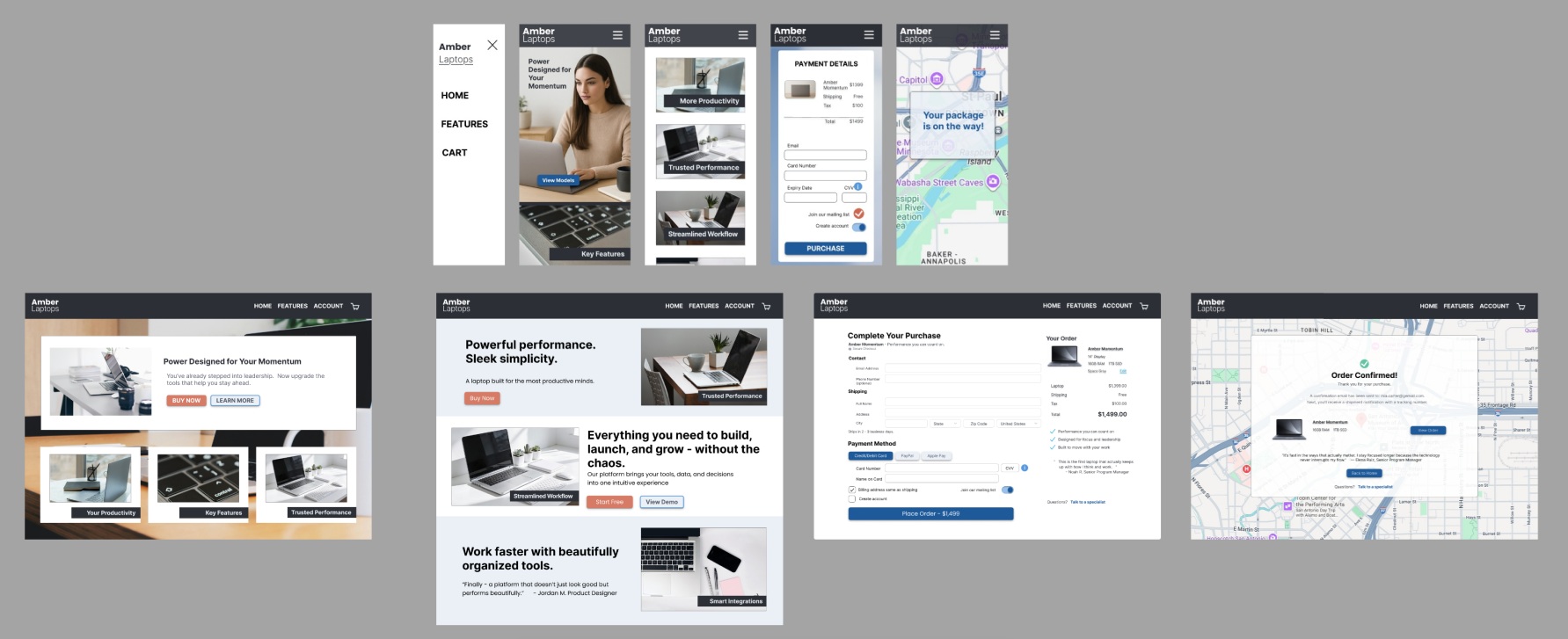
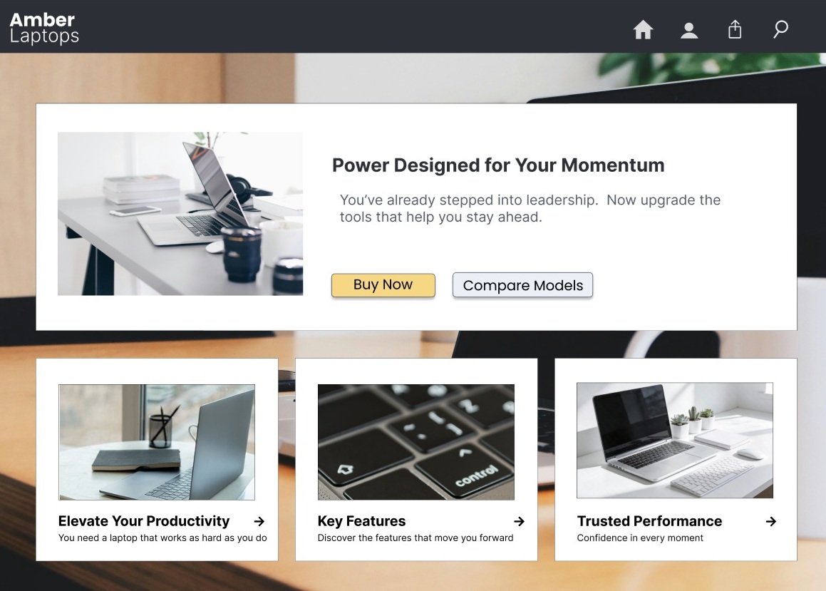
Stage: Finished Design
Designing a Website
The process starts by turning a few key parameters—like audience, goals, and constraints—into a clear, focused brief that sets the direction.
From there, lo-fi mobile wireframes are created in a tool such as Figma to quickly map out content, layout, and user flows without getting distracted by visuals.
Once the mobile experience feels solid, the design is thoughtfully expanded into desktop wireframes.
Finally, everything comes together in a hi-fi draft with imagery, visual polish, subtle effects, and refined interactions, resulting in an experience that feels cohesive, intuitive, and enjoyable to use.